Book Cover Designs
Gingerbread, by Helen Oyeyemi
Book Cover Design #1
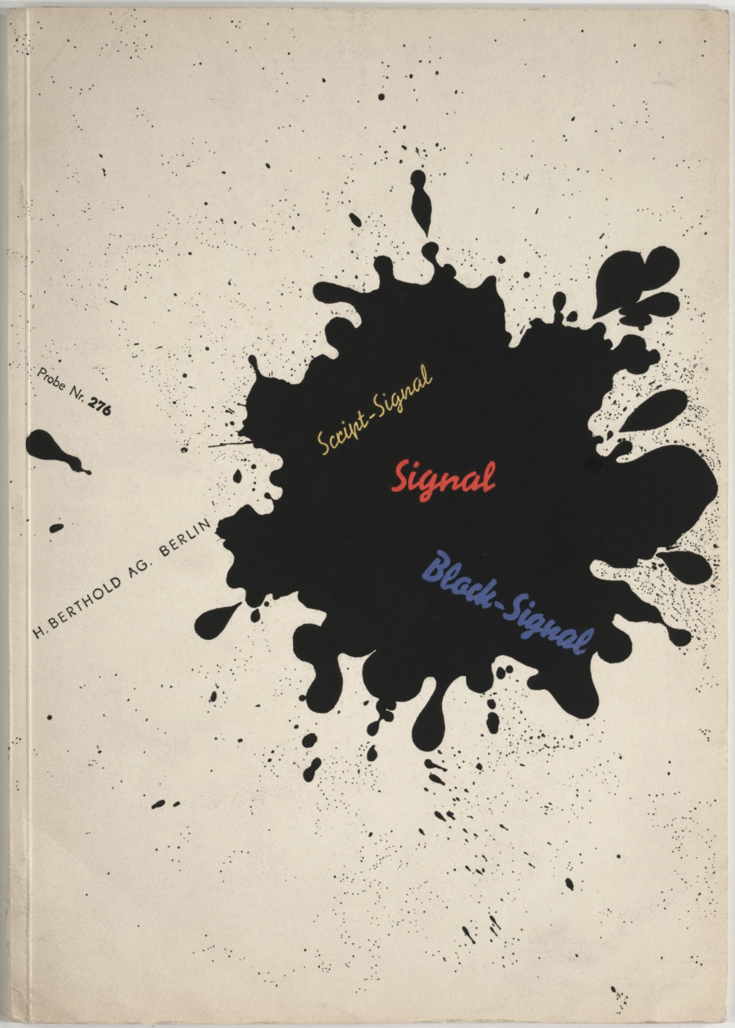
For the first book cover design we were asked to use only type, geometric shapes, lines and a monochromatic colour scheme. We also had to maintain the chosen grid from our designer - I chose to use the grid structure from Bayer’s Signal (1929). I decided on this grid structure because of its simplicity and minimalistic design. I thought that this would make a good contemporary book cover design.
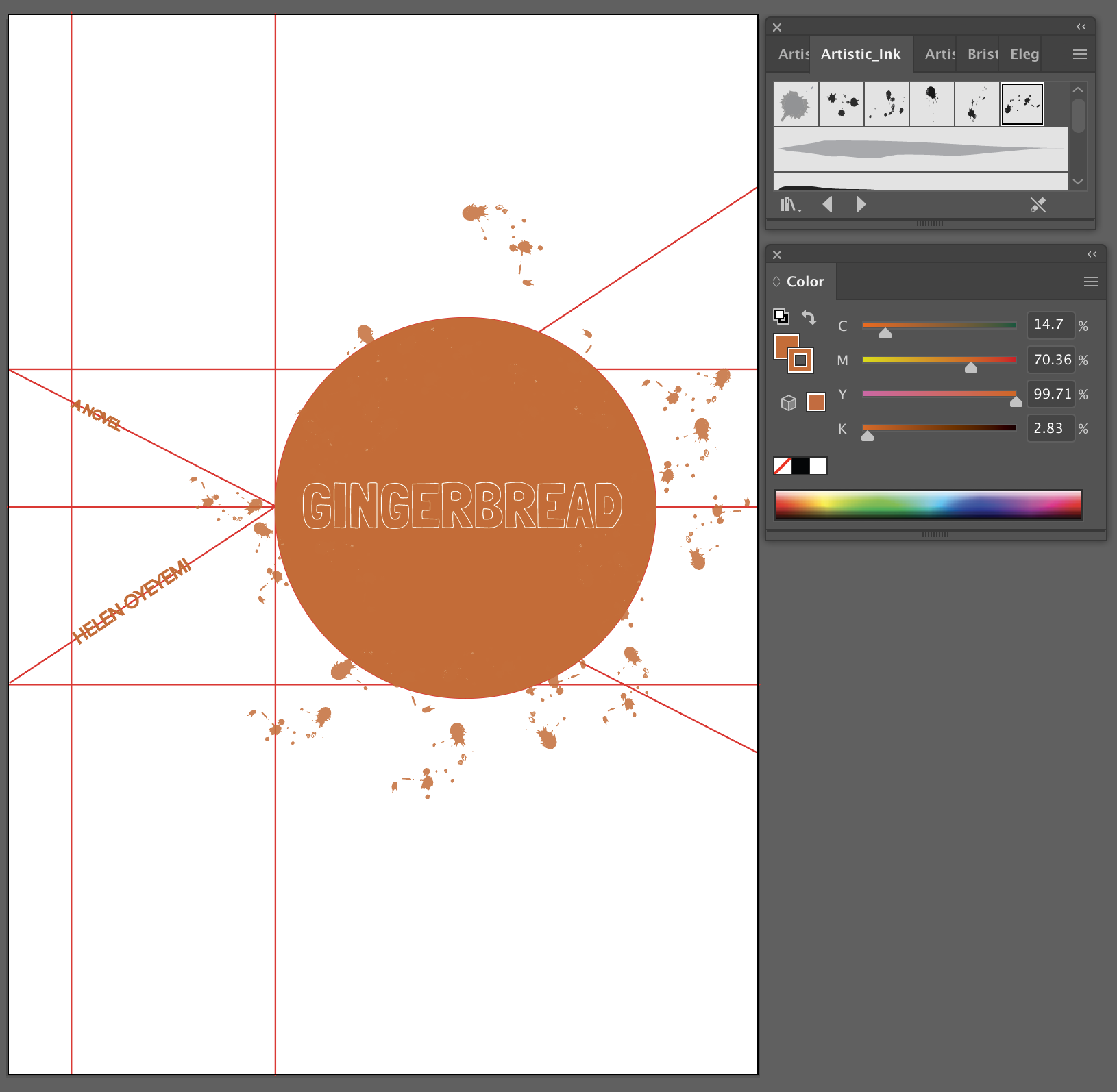
The book I finally decided on is Gingerbread (2019) by Helen Oyeyemi. Because of the title, I decided on the brown/orange to literally represent gingerbread.
After a lot of experimentation with type and placement of the text, this is the final design I came up with. I used two different sans serif typefaces in all caps.
I ended up using a circle as the main focal point - I used an artistic brushstroke for the stroke of the circle to create the spattered paint effect. I completed this cover in Photoshop by applying a paper texture. I really like how this first cover turned out - I feel that the use of white space is very eye-catching and the elements are well balanced.
Book Cover Design #2
For the second book cover design we were asked to integrate image and type into our design to express the theme of the book. We also had to use the same grid.
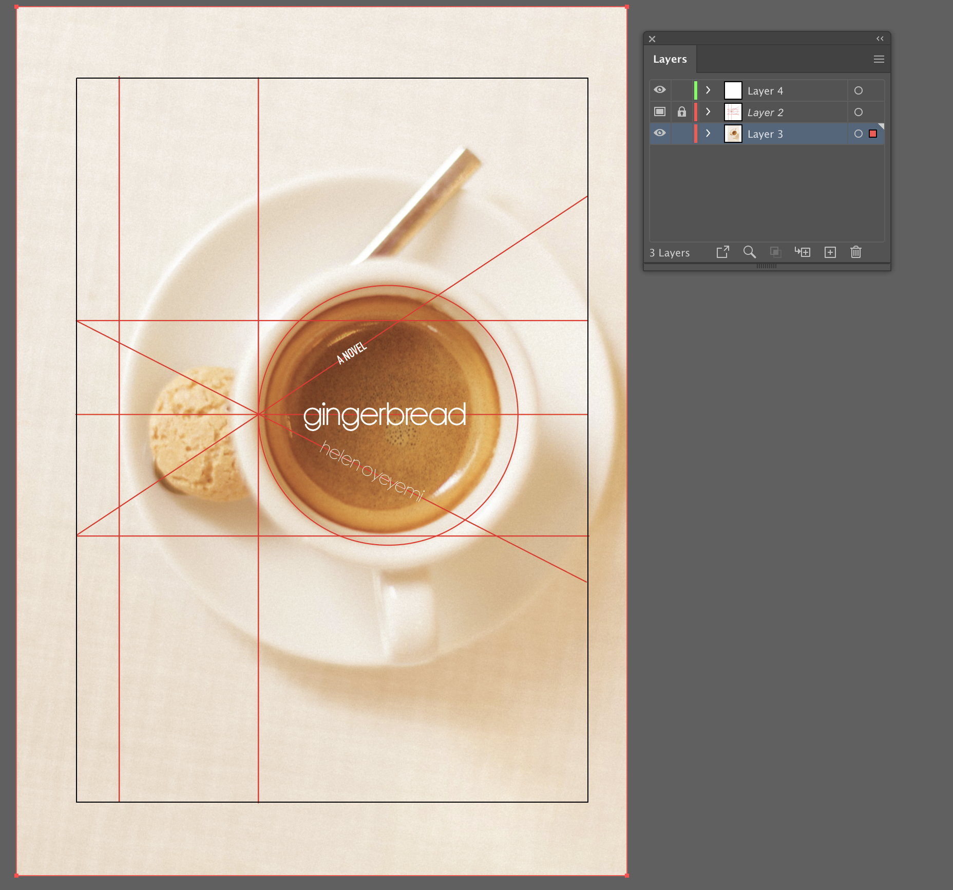
Gingerbread (2019) is a complicated, fantastical story. At its roots it is about family and the family recipe for gingerbread. I decided on this photograph of a cup of coffee with a (gingerbread?) biscuit photographed from above to fit the circular focal point of Bayer’s grid. I also liked the normal/everyday feel of this photograph which juxtaposes with the imaginative and magical world inside the book.
For this second cover I also used the same brown/orange colour as a tint over the entire page. This time I used a mix of lower case and all caps text, still using sans serif typefaces. I also finished this design in Photoshop with both a paper texture and a canvas texture finish.
This second design was a lot harder for me. I had to start over quite a few times, but I am very happy with how this one turned out. It is very different from the first and yet also very similar because of the grid structure. I love the simplicity of the design and the use of space. The cup is off centre and yet balanced with the biscuit and text on the left. I also really like how the spoon handle follows the same angle as the text “A Novel” and becomes part of the grid as well.
Visual Analysis and Grid Structure of Bayer’s Signal (1929)…


